Drawing in my journal has made me develop an interest in design. After my first few attempts at noting things down, I realized my pages were such a mess, I couldn't comprehend anything. So, I decided to learn some things about graphic design so I could lay out my thoughts and write with different typefaces.
Typefaces all begin with a pencil and ruler. Then they are scanned into a computer system and digitized. What I like to do is take these digitized fonts and replicate them back on paper. I like the way they look imperfect, but at the same time, very clean.
As an exercise, I practiced writing some of the different web safe typefaces with my colors. I also learned a little bit about each. Many of the sans serif fonts look the same hand drawn because the differences are quite subtle between them.
Times New Roman

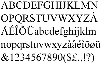
The Times New Roman typeface is a Serif type face. That means it has a small line (called a serif) attached to different letters. The font was created in 1931 for a British newspaper called The Times after a designer wrote an article criticizing the print and typography of the newspaper. They did a pretty good job of fixing the issue, because Times New Roman is the basis for most serif fonts in existence.
Arial

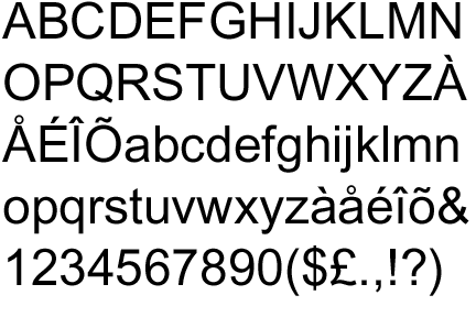
If Times New Roman is the basic serif, then Arial is the basic sans serif. It's used everywhere and it has 20+ variants. The typeface was created in 1982.
Georgia

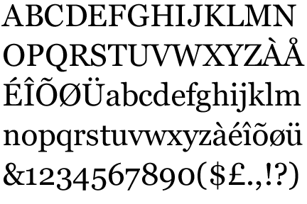
Georgia is another serif font that's similar to Times New Roman. It was designed in 1993 as a more readable serif font, released as a companion to the font Verdana.
Verdana

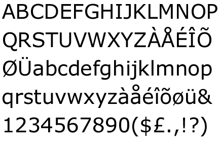
Verdana is a humanist sans serif font. Sans serif means it does not contain those tiny lines. Humanist means it is meant to look calligraphic. It was also created to look good on a computer screen.
Trebuchet


Trebuchet (pronounced either tre-bu-shet or tre-bu-shay) is another humanist sans serif typeface commissioned by Microsoft to look good on computer screens.
Courier


Courier is a monospaced slab serif. Monospaced means each letter and character occupies the same amount of width. Slab serif means the serifs are thick and blocklike. This font was created in 1955 to replicate the look of a typewriter.
Impact

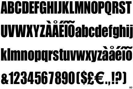
Impact is a realist sans serif that has thick strokes and compressed spacing in order to create an "impact." It's used frequently in internet memes.
Helvetica

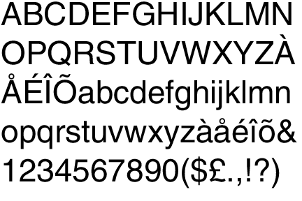
Helvetica has an interesting history, because it wasn't simply created for computers like many of the other web safe fonts. The typeface was developed in 1957 as part of the International Typographic Style (or Swiss Style) movement in graphic design. The font is a basic sans serif, but it has a tinge more flavor than Arial.


No comments:
Post a Comment